
What Are the 2026 Best Sign Design Ideas?

Time:2026-10-03 Author:Amelia
0%

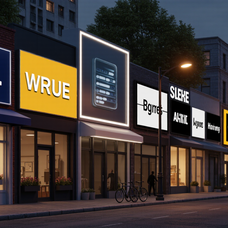
In 2026, effective signage will do more than display a message. It will guide attention, support accessibility, and strengthen a brand’s physical presence. The best Sign Design Ideas will balance clear communication with memorable visual details. Think of a storefront sign glowing softly at dusk, with lettering that remains readable from across a busy street.

Designers are exploring layered materials, tactile lettering, energy-efficient lighting, and adaptable digital displays. These choices can create depth without making a sign feel crowded. High-contrast colors help people read quickly, while generous spacing improves comfort for viewers with different visual abilities. A professional sign maker should also consider viewing distance, weather exposure, mounting height, and maintenance costs before approving a concept.

Small details matter.

In my experience, attractive signs sometimes fail because they prioritize decoration over direction. A beautiful design may disappear under harsh sunlight or become confusing when viewed from an angle. That weakness deserves attention, not excuses. Testing a mockup at morning, noon, and evening can reveal problems early. Feedback from customers, employees, and accessibility specialists adds practical evidence to the creative process.

This guide examines promising 2026 sign design trends through a realistic lens. It considers materials, typography, color systems, lighting, sustainability, and digital integration. Some ideas will look impressive in a presentation but perform poorly outdoors. Reliable design comes from testing, measured decisions, and a willingness to revise. The strongest signs are not merely noticed. They are understood, remembered, and trusted.
What Are the 2026 Best Sign Design Ideas?

2026 Sign Design Criteria: Apply 3-Second Recognition Testing

What Are the 2026 Best Sign Design Ideas?

A strong 2026 sign should pass a three-second recognition test. Show it briefly from the intended viewing distance. Then ask viewers what they saw, where it belongs, and what action it suggests. If answers differ, the design needs work. Keep the message short, use one dominant image, and place the key word near eye level. High contrast matters, especially beside moving traffic, glass reflections, or afternoon glare. The Sign Research Foundation’s Economic Value of On-Premise Signage study found that 60% of businesses gained new customers after installing or improving signage. Visibility creates commercial value, but recognition comes first.

Test the sign in realistic conditions. Use a busy sidewalk, a dim corridor, or a moving vehicle simulation. The Outdoor Advertising Association of America reported that out-of-home media reaches more than 80% of adults monthly, making brief exposure a practical design reality. Avoid thin lettering, crowded icons, and decorative fonts. A viewer should identify the sign’s purpose before reading every detail. Three seconds is not a perfect measurement. I still miss weak layouts when testing only on a bright screen. That is the flaw worth documenting. Retest with older viewers, people standing farther away, and viewers distracted by phones. Record wrong answers, not compliments. The best design earns instant recognition without demanding extra effort.

Legibility by Distance: Use Sign Research Foundation Viewing Data

What Are the 2026 Best Sign Design Ideas?

Legibility by distance should guide every sign decision in 2026. Sign Research Foundation viewing data shows that distance changes how people read, notice, and trust visual information. A message that works at ten feet may disappear at one hundred feet. Designers should test viewing distance before choosing type size, spacing, or color contrast. Measure it in real conditions, not only on a bright computer screen.

Use short wording with a clear visual order. The largest text should carry the main message first. Supporting details need more breathing room and stronger contrast. Avoid thin lettering, decorative fonts, and crowded layouts. At a roadside location, drivers have only a few seconds. That is not enough time for clever puzzles. Large forms help.

Field experience also exposes uncomfortable mistakes. A sign can look polished indoors but fail under glare, rain, or evening shadows. I have seen attractive layouts lose meaning because their letters were too close together. Small testing panels can reveal these problems early. Place sample signs at measured distances, then ask unfamiliar viewers what they noticed first. Their answers may challenge the designer’s intentions. Good research does not remove judgment. It makes judgment more accountable.

What Are the 2026 Best Sign Design Ideas? - Legibility by Distance: Use Sign Research Foundation Viewing Data

A practical planning table for selecting letter height according to expected viewing distance.

Distance-Based Sign Legibility Planning Data
Expected Viewing Distance Minimum Capital-Letter Height Approx. Metric Height Suitable Sign Situation 2026 Design Recommendation
30 ft / 9 m 3 in 76 mm Pedestrian signs, room identification, close-range directories Use short wording, strong contrast, and generous spacing between lines.
50 ft / 15 m 5 in 127 mm Building entrances, parking identification, pedestrian approaches Prioritize one clear message and avoid condensed letterforms.
75 ft / 23 m 7.5 in 191 mm Small parking-lot signs and low-speed directional signs Use mixed-case text where appropriate and maintain a simple visual hierarchy.
100 ft / 30 m 10 in 254 mm Driveway identification, site-entry signs, low-speed vehicle circulation Increase contrast, reduce copy, and keep critical information away from edges.
150 ft / 46 m 15 in 381 mm Approach signs and directional signs viewed from moving vehicles Use fewer words, larger symbol elements, and a non-glare sign face.
200 ft / 61 m 20 in 508 mm Longer-range site identification and high-speed approach conditions Design for rapid recognition with large cap height, high contrast, and minimal copy.

How to use the table

The planning baseline is approximately 1 inch of capital-letter height for every 10 feet of viewing distance. Select the next larger size when viewing time is short, the sign is viewed at an angle, lighting is poor, glare is present, or the audience may include older viewers or people with reduced visual acuity.

Additional legibility checks

  • Use strong foreground-to-background contrast and avoid low-contrast color combinations.
  • Keep letter spacing, line spacing, and margins generous enough to prevent visual crowding.
  • Test the sign from the actual approach path, not only from a close distance.
  • Confirm local accessibility, roadway, illumination, and zoning requirements before fabrication.

Source basis: Sign Research Foundation viewing-distance and letter-height guidance. Values are rounded planning equivalents; final sizing should account for speed, contrast, viewing angle, illumination, message complexity, and local regulations.

Accessible Signs: Meet ADA 703.2 and WCAG 2.2’s 4.5:1 Contrast Ratio

What Are the 2026 Best Sign Design Ideas?

Accessible signs begin with practical compliance, not decoration. ADA 703.2 requires raised characters that help people identify rooms, exits, and permanent spaces through touch. Characters should be uppercase, durable, and positioned consistently. Braille also supports tactile reading, although it is covered separately under ADA 703.3. This distinction is easy to miss.

Visual design matters too. WCAG 2.2 recommends at least a 4.5:1 contrast ratio for normal-sized text against its background. Use dark lettering on a light surface, or reverse the combination carefully. Avoid glossy finishes, thin strokes, and crowded layouts. A sign can meet the ratio on a screen yet fail under dim hallway lighting. Real spaces are less predictable than design software.

Tips: Test a full-size sample at eye level. Check it under daylight and artificial light. Measure contrast with a reliable tool. Confirm raised characters feel clear, not sharp. Leave enough spacing around text and symbols. Ask people with different visual and tactile needs to review the sign. Their feedback may expose a weak assumption. We sometimes focus too heavily on technical measurements and forget human behavior. A rushed visitor may read from an angle, touch the sign quickly, or miss an unclear mounting location. Good sign design anticipates those imperfect moments.

Digital Signage: Design 10-Second Content Cycles for Audience Attention

What Are the 2026 Best Sign Design Ideas?

Digital signage works best when each message respects a viewer’s limited attention. A ten-second content cycle should deliver one clear idea, not a crowded list. Use the first two seconds for a strong visual cue. Show the main message from seconds three to seven. Reserve the final moments for location, action, or timing details. Large type, high contrast, and generous spacing improve readability across bright lobbies and busy sidewalks. Test the screen from several distances.

Motion should guide attention, not create noise. A product image can fade in gently, while a small directional arrow moves once. Avoid constant animation. It tires the eye and can hide essential information. Keep key text visible for at least three seconds. Short phrases work better than complete explanations. “Fresh meals, five minutes away” is easier to absorb than a dense promotional paragraph.

Real-world testing often exposes weak assumptions. I once preferred a stylish thin font, but it disappeared under reflective glass. That mistake changed the design. Now I check contrast, viewing angles, glare, and accessibility before approval. Captions should remain readable without sound. Color should not carry meaning alone. Leave space for translation, schedule changes, and emergency updates. A polished cycle can still fail if people cannot understand it while walking. Track dwell time and missed interactions, then revise the next version.

Sustainable Sign Systems: Compare EPDs, ISO 14001 Suppliers, and Lifecycles

What Are the 2026 Best Sign Design Ideas?

Sustainable sign systems should be judged beyond appearance. The 2023 Global Status Report for Buildings and Construction attributes 37% of global energy-related and process emissions to the sector. Sign designers should therefore examine material sourcing, fabrication, lighting, transport, maintenance, and disposal.

Start with Environmental Product Declarations, or EPDs. Compare the same declared unit across suppliers, not attractive carbon claims. Check product-stage emissions, transport assumptions, recycled content, and end-of-life scenarios. ISO 14025 and EN 15804 provide useful frameworks for transparent comparisons. A credible EPD should be independently verified. Still, EPD figures can differ because system boundaries differ. That is easy to miss.

ISO 14001 certification adds another layer. The ISO Survey 2023 recorded 606,947 ISO 14001 certificates worldwide. This indicates environmental management experience, but it does not prove that a sign has low embodied carbon. Ask for measured targets, audit evidence, waste records, and supplier-specific data. Use bolted aluminum frames, replaceable LED modules, and mechanically fixed faces. These details support repair and disassembly. Avoid permanent adhesives when practical.

Lifecycle planning

Lifecycle planning should include A1–A3 manufacturing, A4 transport, use-stage electricity, and end-of-life recovery. A lightweight sign may still perform poorly if it requires frequent replacement. A perfect score is unlikely. The better question is whether the design remains useful, repairable, and measurable for years.

FAQS

Why is viewing distance important in sign design?

A message visible at ten feet may disappear at one hundred feet. Test signs at the distance people will actually view them.

How should text be arranged on a readable sign?

Make the main message largest and easiest to find. Keep supporting details shorter, spaced apart, and strongly contrasted.

Which typefaces work best for signs?

Use clear, sturdy lettering with simple shapes. Avoid thin strokes, decorative fonts, and tightly packed letters.

How can roadside signs help drivers?

Use large forms and very short wording. Drivers may have only a few seconds to notice and understand the message.

What can indoor sign testing miss?

Indoor testing may hide glare, rain, shadows, and weak contrast. A polished layout can fail outside.

How should accessible signs support touch and vision?

Use durable raised uppercase characters for permanent rooms and spaces. Add clear Braille where tactile reading is required.

What contrast level is recommended for normal-sized text?

Aim for at least a 4.5:1 contrast ratio. Check the finished sign, not only the computer design.

How can designers find hidden sign problems?

Place a full-size sample at eye level and measured distances. Test it in daylight and artificial light with unfamiliar viewers.

Why should people with different needs review a sign?

Someone may read from an angle, touch it quickly, or miss its mounting position. Their feedback can challenge weak assumptions.

What design mistake deserves more reflection?

We sometimes trust technical measurements too much. Real visitors behave imperfectly, and the sign must still communicate clearly.

Conclusion

The best Sign Design Ideas for 2026 combine instant recognition, accessibility, audience engagement, and environmental responsibility. A strong sign should pass a three-second recognition test, allowing viewers to understand its purpose quickly. Designers should also evaluate legibility at realistic viewing distances by considering letter height, spacing, lighting, and placement. Accessible signs need to follow ADA 703.2 requirements and provide sufficient color contrast, including the 4.5:1 contrast ratio recommended by WCAG 2.2 for readable digital and printed content.

Digital signage should use focused messages and approximately 10-second content cycles to match audience attention spans without overwhelming viewers. Sustainable sign systems should be assessed through material lifecycles, Environmental Product Declarations, and suppliers with ISO 14001-based environmental management practices. By balancing clarity, compliance, technology, and sustainability, sign designers can create communication systems that remain effective, inclusive, and durable throughout 2026.

Amelia

Amelia

Amelia is a seasoned marketing professional with a wealth of expertise in our company’s core offerings. With an unwavering passion for driving growth and innovation, she plays a pivotal role in shaping our marketing strategies and enhancing brand visibility. A key aspect of her responsibilities......