
Indoor Signage For Business is more than decoration on a wall. It guides movement, explains services, strengthens brand memory, and reduces small moments of uncertainty. A visitor may notice a reception sign before speaking to anyone. In a retail store, a clear aisle marker can prevent a frustrating search. In an office, consistent room signs help employees and guests move confidently.
The business impact is measurable. The FedEx Office Signage Impact Study, conducted with approximately 1,000 U.S. adults in 2012, reported that 76% of consumers had entered a store because of its signs. The same study found that 68% had purchased something after noticing a sign. It also reported that 67% believed signage reflected the quality of a business. These figures show why indoor signs deserve strategic attention, not last-minute placement.
The Sign Research Foundation and the University of Cincinnati have also examined signage as a business investment. Their research connects readable, visible signs with customer attraction and commercial performance. Still, the evidence is not perfect. A sign alone cannot repair poor service, confusing pricing, or an unpleasant environment. Good design needs context. Lighting, viewing distance, language, accessibility, material, and maintenance all matter. The following guide explores the top 10 types of indoor signage for business, from reception displays and directional signs to digital screens and safety communication. Each type offers a practical advantage, but each can fail when it becomes crowded, vague, or visually disconnected from the space. Small details matter. A sign should help people act.
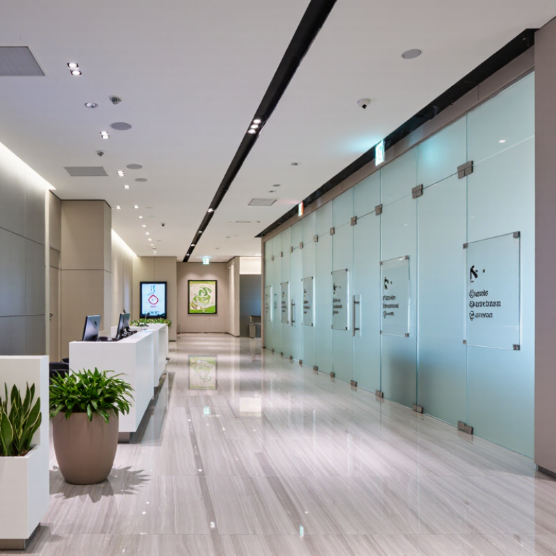
Top 10 Types of Indoor Signage for Business
Understanding Indoor Business Signage and Its Main Purposes
Indoor business signage does more than decorate a wall. It guides visitors, confirms locations, reduces confusion, and shapes the first few seconds inside a facility. Common types include wayfinding signs, directory boards, room identifiers, reception signs, safety notices, regulatory signs, promotional displays, menu boards, digital screens, and tactile signs. Each type should answer one practical question. Where am I? Where should I go?
A Sign Research Foundation study on the economic value of on-premise signage reported that 60% of surveyed businesses experienced sales increases after improving their signs. The average reported increase was about 10%. That figure does not prove every indoor sign will produce revenue. Still, it shows why visibility deserves measurement. Track fewer questions at reception, faster navigation, or longer engagement near displays. Small details matter. A sign hidden behind a plant has failed.
Effective signs use readable type, strong contrast, consistent symbols, and suitable viewing distances. Placement should match visitor behavior, not the designer’s favorite wall. Digital displays can update information quickly, while printed signs often remain clearer during busy periods. Tactile and accessible formats support more people, but they are sometimes treated as an afterthought. That is a design weakness. Test signs with real visitors, including people unfamiliar with the building, then revise wording, height, and location when confusion appears.
Top 10 Types of Indoor Signage for Business
Wayfinding signs help visitors move through offices, hospitals, schools, and retail spaces without constant assistance. In practice, clear direction reduces hesitation near entrances, lifts, and busy intersections. Directional arrows, entrance signs, and floor numbers should appear before visitors need to make a choice. Place them at eye level, where people naturally slow down. Keep it simple.
Useful wayfinding systems may include directory boards, floor maps, room identifiers, stair signs, elevator signs, restroom signs, and emergency exit signs. Each sign should use consistent colors, readable lettering, strong contrast, and familiar symbols. An accessibility review should consider wheelchair routes, tactile information, and viewing height. A map that looks accurate on a screen may confuse visitors inside the building. That matters.
I have seen people follow a sign, stop, and look back because the next arrow was missing. This small gap can make a polished facility feel disorganized. Test signs with first-time visitors, not only staff who already know the layout. Ask where they expected the next marker. Some signs may need larger text, while others may need less information. Wayfinding is not decoration; it is a practical service shaped by real movement, attention, and occasional mistakes.
| No. | Indoor Signage Type | Primary Function | Typical Locations | Common Information Displayed | Accessibility Considerations | Best Use in Visitor Journeys |
|---|---|---|---|---|---|---|
| 1 | Directional Wayfinding Signs | Guide visitors toward destinations and reduce uncertainty at decision points. | Corridors, intersections, elevator lobbies, stairwells, and large public areas. | Arrows, room names, floor numbers, departments, and destination lists. | Use high contrast, clear arrows, readable type, and consistent placement. | Directing visitors from entrances to offices, service areas, meeting rooms, or amenities. |
| 2 | Directory Boards | Provide an overview of multiple destinations within a building or floor. | Main entrances, reception areas, lobbies, and elevator landings. | Business names or departments, suite numbers, floor locations, and service categories. | Organize information in a logical hierarchy and avoid crowded layouts. | Helping visitors identify their destination before choosing a route. |
| 3 | Room Identification Signs | Identify a specific room, office, department, or facility. | Beside or near room entrances, offices, classrooms, and consultation rooms. | Room name, number, department, occupant function, or operating status. | Include tactile lettering and Grade 2 Braille where required by applicable standards. | Confirming that visitors have reached the correct destination. |
| 4 | Reception and Welcome Signs | Make the primary arrival point easy to recognize and establish a welcoming impression. | Entrance vestibules, reception desks, visitor check-in areas, and waiting rooms. | Reception, visitor check-in instructions, welcome messages, and service hours. | Position signs where they are visible from the entrance and readable while standing or seated. | Helping first-time visitors find assistance immediately after entering. |
| 5 | Safety and Emergency Signs | Communicate hazards, emergency actions, and safety-related information. | Stairways, corridors, mechanical areas, laboratories, kitchens, and public spaces. | Emergency exits, fire equipment, first-aid locations, warnings, and required protective equipment. | Use recognized safety symbols, strong contrast, and unobstructed placement. | Supporting safe movement and quick response during routine operations or emergencies. |
| 6 | Regulatory and Compliance Signs | Inform occupants about rules, restrictions, legal notices, and required procedures. | Entrances, restricted areas, service counters, washrooms, and staff-only zones. | No smoking, authorized personnel only, occupancy limits, photography restrictions, and notices. | Use concise wording, recognizable symbols, and appropriate contrast for the environment. | Setting clear expectations and helping occupants follow building or facility rules. |
| 7 | Room Availability and Status Signs | Show whether a room or service area is available, occupied, reserved, or closed. | Meeting rooms, interview rooms, consultation spaces, and shared work areas. | Available, occupied, reserved, in use, closed, or cleaning status. | Use readable text and color-independent indicators so status is not communicated by color alone. | Reducing interruptions and helping visitors select an available room or service point. |
| 8 | Facility and Amenity Signs | Identify shared amenities and essential visitor services. | Washrooms, cafeterias, lounges, elevators, information points, and accessible facilities. | Facility names, universal symbols, accessible routes, and service directions. | Use internationally recognized pictograms and indicate accessible options where applicable. | Helping visitors locate everyday services without needing staff assistance. |
| 9 | Floor and Zone Identification Signs | Help visitors understand their current level, area, or building zone. | Elevator lobbies, stair landings, corridor entrances, and open-plan facility zones. | Floor numbers, zone names, color-coded areas, and grouped destinations. | Pair color systems with text or symbols to support visitors with color-vision differences. | Reinforcing orientation when visitors change floors or move between distinct areas. |
| 10 | Digital Information and Interactive Signs | Display changing information, maps, announcements, or interactive directions. | Large lobbies, visitor centers, reception areas, transport facilities, and event venues. | Interactive maps, room schedules, queue information, alerts, and event directions. | Provide readable text, clear navigation, keyboard or touch accessibility, and non-visual alternatives where needed. | Providing real-time guidance when destinations, schedules, or visitor instructions change frequently. |
Top 10 Types of Indoor Signage for Business: Informational and Safety Signs for Clear Communication
Indoor signage should guide people before confusion begins. Directional signs, room labels, restroom markers, reception signs, and emergency notices create a visible path through busy spaces. The 2023 Bureau of Labor Statistics report recorded about 2.6 million nonfatal workplace injuries and illnesses in private industry. Clear warnings cannot prevent every incident, but they can reduce hesitation near wet floors, restricted areas, stairs, and exits.
Safety signs need strong contrast, readable type, and familiar symbols. ISO 7010 provides standardized safety symbols, while OSHA requires workplace signs to be visible and understandable. Emergency exit signs should remain noticeable during smoke, power loss, or crowd movement. Accessibility matters too. The 2010 ADA Standards specify tactile characters, Braille, and mounting requirements for many permanent room signs. A sign may meet technical rules and still confuse visitors. That is a useful weakness to examine.
Tips: Test signs with someone unfamiliar with the building. Ask them to find the nearest exit, elevator, or first-aid station without assistance. Record where they pause. Keep messages short, such as “Wet Floor,” “Staff Only,” or “Exit to Lobby.” Place directional signs before decision points, not after them. Use consistent colors and symbols across every floor. Review signs after renovations, because old arrows quietly become misleading.
Top 10 Types of Indoor Signage for Business
Branding Signs That Strengthen a Business’s Interior Identity
Indoor signs do more than direct visitors. They shape how a workplace feels and is remembered. A reception logo wall creates immediate recognition, while dimensional lettering adds depth behind the front desk. Wayfinding panels, room plaques, window graphics, wall murals, elevator signs, menu boards, promotional displays, safety notices, and digital directories form a practical interior system.
Material choices should match the business experience. Brushed metal suggests precision, warm wood feels approachable, and layered acrylic catches light without overwhelming a small lobby. Typography must remain readable from several steps away. Contrast matters in corridors with uneven lighting. During installation projects, I have found that visitors notice poor alignment faster than owners expect. Small errors matter.
A strong sign family repeats colors, spacing, shapes, and voice across different rooms. It should guide people quietly, not compete with staff or products. Measure sightlines before approving artwork, then test a full-size sample on the actual wall. This can reveal glare, awkward scale, or colors that look different indoors. Digital signs offer flexibility, but changing content too often can weaken recognition. Not every surface needs branding. Restraint is difficult, and the best sign may be smaller than the first draft.
Branding signs that strengthen a business’s interior identity through navigation, recognition, and customer experience.
The chart uses a 1–10 interior identity impact index based on each signage type’s typical contribution to brand recognition, wayfinding, customer experience, and space definition. Higher scores indicate stronger potential to shape a business’s interior identity.
Indoor signage works best when its location matches its purpose and audience. Reception signs should establish identity near the entrance. Directional signs belong at decision points, such as corridors and elevator lobbies. Room identification signs help visitors find offices without asking staff. Restroom signs need strong contrast and familiar symbols.
Safety signs should remain visible during busy periods. Promotional signs work near checkout areas, waiting zones, or product displays. Menu boards suit cafés and food counters, while digital displays support changing information. Wall graphics can shape the atmosphere, and floor or ceiling signs can guide movement when wall space is limited. Each type serves a different moment.
Audience needs matter as much as design. Visitors may need simple words and clear arrows. Employees may prefer coded room labels. Children, older adults, and people with limited vision may require larger text, stronger contrast, or tactile details. I have seen attractive signs fail because they were mounted too high or placed after the turn. That mistake is easy to make. Measure viewing distance, lighting, walking speed, and likely crowd movement before production. A sign that looks perfect on a screen may feel weak in a dim hallway. Leave room for revision. Businesses often change layouts, services, and opening hours, so permanent graphics can become inconvenient. Reliable signage is not merely decorative; it reduces hesitation and supports a calmer indoor experience.
It guides visitors, confirms locations, reduces confusion, and shapes their first impression. Clear signs answer, “Where am I?”
Directional signs, room labels, reception signs, restroom markers, safety notices, directories, and digital displays are common choices.
Place them before decision points, such as corridor turns, elevators, or stairways. Arrows placed afterward are often too late.
Use short wording, strong contrast, readable type, and familiar symbols. “Wet Floor” works better than a crowded paragraph.
Ask unfamiliar visitors to find an exit, elevator, or first-aid station without help. Record where they stop or turn incorrectly.
Repeated colors, spacing, shapes, and typography create a consistent interior experience. Too much branding can still feel noisy.
Brushed metal can feel precise, wood can feel warm, and layered acrylic can add depth. The best material depends on lighting and surroundings.
No. Digital signs update quickly, while printed signs may remain clearer during busy periods. Frequent content changes can weaken recognition.
Use suitable tactile characters, raised lettering, Braille, readable contrast, and appropriate mounting heights. Technical compliance alone may not prevent confusion.
Hidden signs, glare, poor alignment, tiny text, outdated arrows, and oversized graphics cause problems. A sign may look attractive yet fail in practice.
Indoor Signage For Business plays an important role in making interior spaces easier to navigate, understand, and remember. From reception areas and offices to retail stores, hotels, and public facilities, well-planned signs help visitors find destinations, identify departments, and move through a space with confidence. Common types include directional signs, room and department labels, reception displays, menu boards, notice signs, and clear safety messages. Each type serves a practical purpose while contributing to a more organized and welcoming environment.
Effective indoor signage also supports a business’s interior identity by using consistent colors, typography, materials, and visual elements. Informational and safety signs should be simple, visible, and easy to understand, especially in busy or unfamiliar locations. When choosing signage, businesses should consider its placement, viewing distance, lighting, durability, function, and the needs of different audiences. By matching each sign to its location and purpose, a business can improve communication, strengthen its atmosphere, and create a smoother visitor experience.