1 / 3

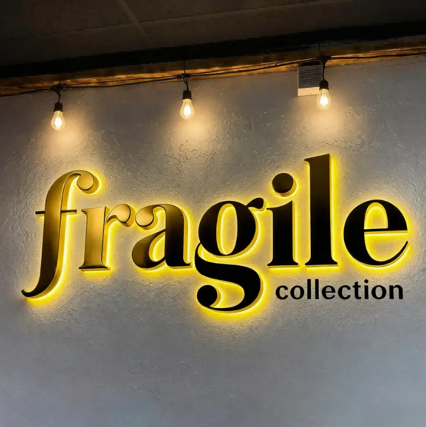
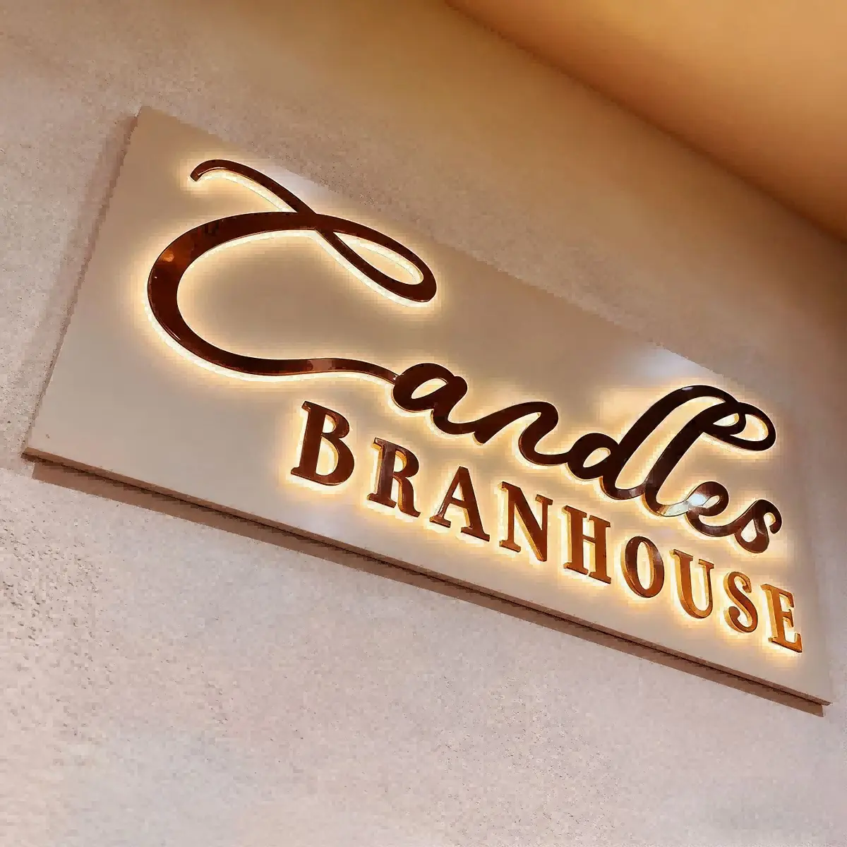
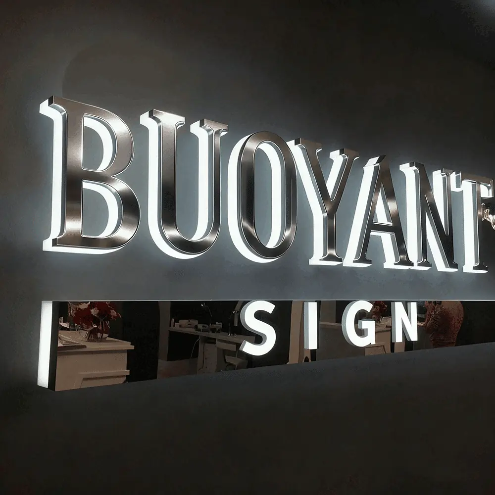
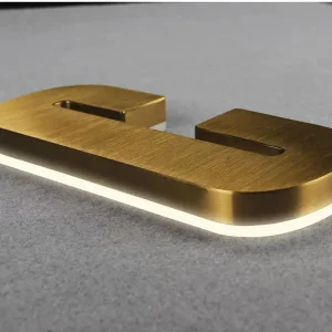
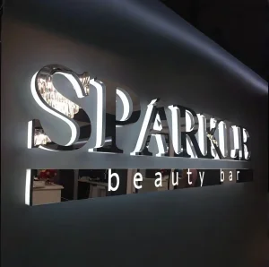
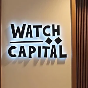
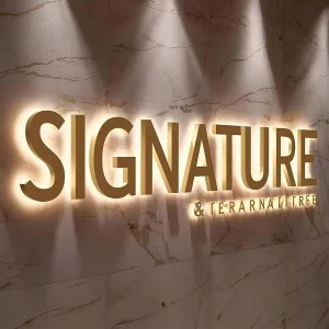
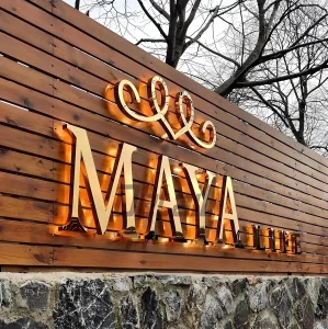
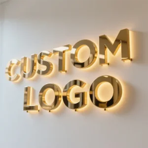
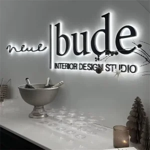
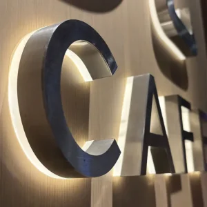
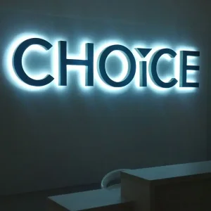
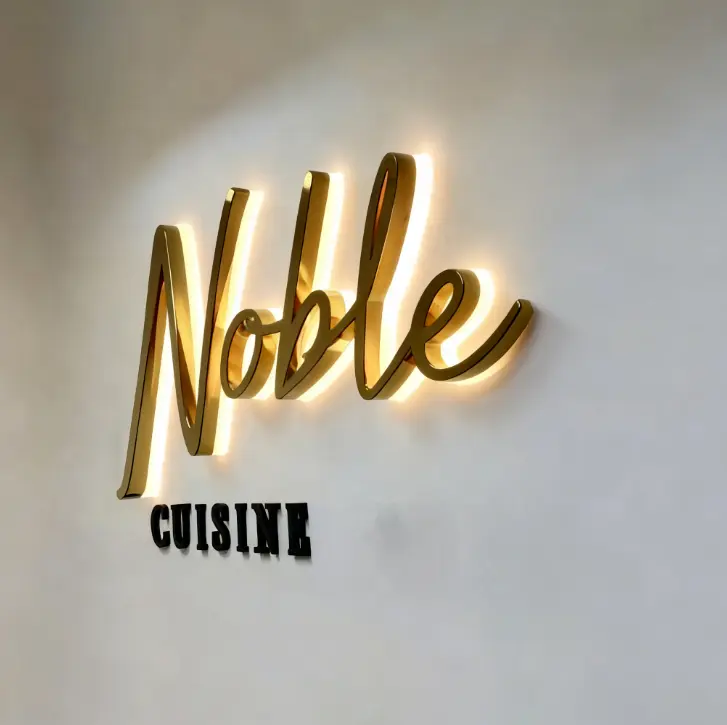
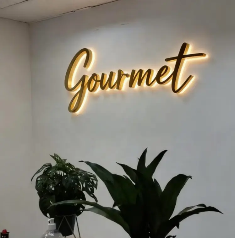
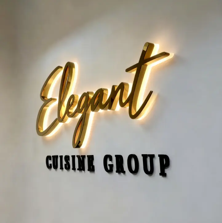
Backlit channel letters have solid metal faces (you can't see through them) and the light shines out the back, creating a glowing outline or "halo" around each letter against your wall.
Day: You see dimensional metal letters
Night: Those letters glow around the edges, appearing to float off the wall
It's a cleaner, more understated look than the bright-faced frontlit style everyone uses. Whether that's good or bad depends entirely on your business.
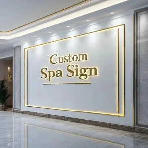
If you're running a high-end restaurant, law firm, medical practice, boutique, or spa, backlit letters communicate sophistication. They say "we care about details and aesthetics."
If you want to differentiate by being more refined rather than louder, backlit works. It avoids the "chain restaurant" look and provides an elegant, expensive feel.
The halo reflects off the surface behind the letters. Clean brick, stucco, or painted walls are ideal for this effect to work correctly.
Highway Locations: On busy roads (45+ mph), the subtle glow lacks the "punch" needed to grab attention at speed compared to frontlit letters.
Budget Constraints: Backlit signs typically cost 10-20% more than frontlit options for the same size.
Wrong Business Type: The sophisticated aesthetic may look out of place for tire shops, fast-food outlets, or auto parts stores.
No Suitable Wall: These cannot be mounted on pylon or monument signs without a backing surface to create the halo effect.
This is where people really mess up with backlit letters. Cheap backlit signs look terrible because the halo is uneven—bright spots, dark spots, and inconsistent glow. It looks amateurish and actually hurts your brand instead of helping it.